In July 2021, we completed rebranding efforts on a refined look for Melbourne’s iconic Prahran Market. We’ve been working with the team there for over 10 years, and in that time, we’ve been lucky enough to assist with various rebrands at different points, yet it was this opportunity that most filled us with excitement.
Prahran Market for a long time has been known as “The Food Lovers’ Market”: a way to differentiate the Market from others across Melbourne as well as local supermarkets. The suggestion being that if you’re a fan of food and want the best quality ingredients, Prahran Market is the place to be. While there have been variations on this theme over the years, it’s always come back to this idea, more focused on the food on offer, and how that benefits our customers.
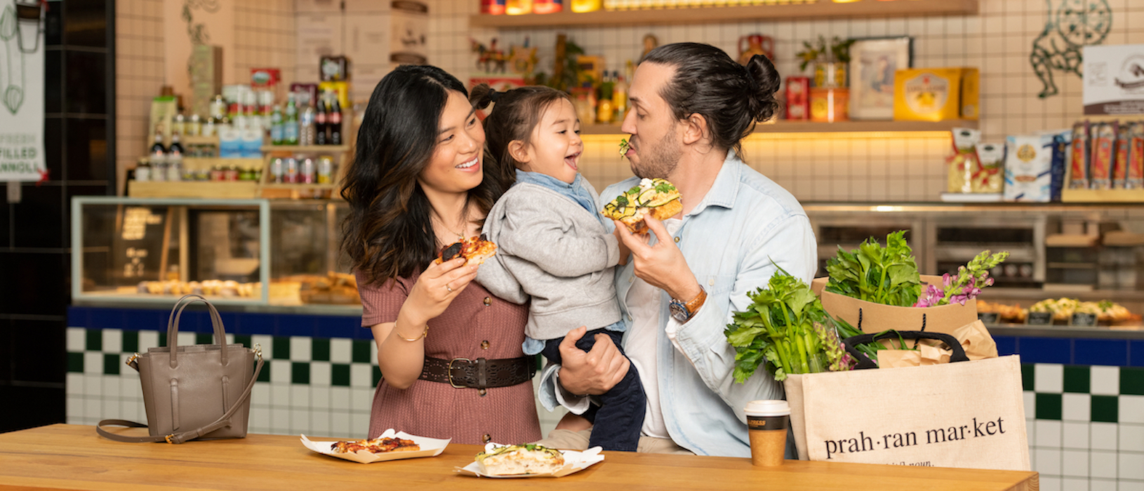
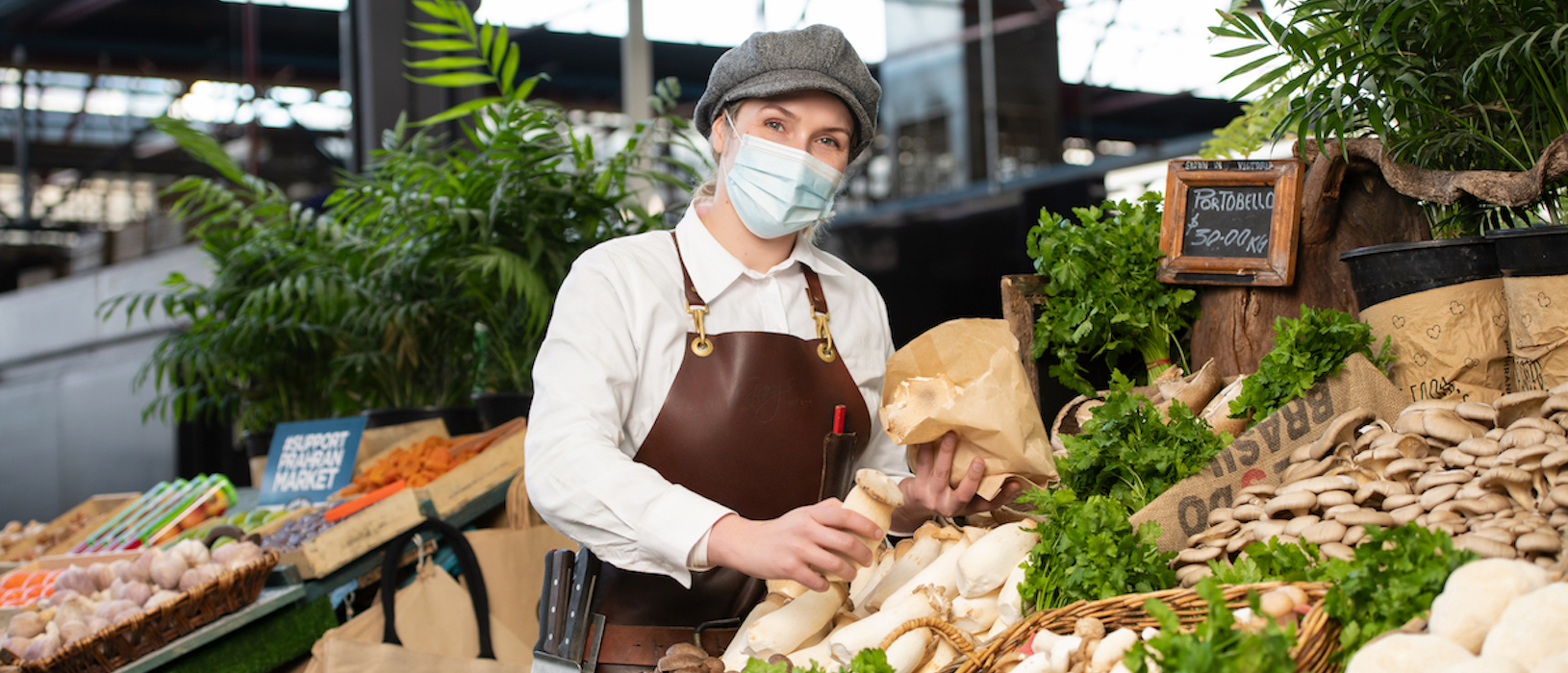 However, the brief for this new rebrand very much centred on the idea of presenting the Market as a cornerstone of the community; a place where food lovers could come, not just for fresh produce, but for delicious meals, socialising and of course, fantastic food-centric events. Have no doubt, food is still a huge feature of the Market, how could it not be. But we want to communicate with people that the Market is so much more than just food and traders; it really is a community where friends can shop together, making connections with locals and traders alike.
So, not only did we need to present the Market as a community hub, but we also needed to streamline our creative direction to be a little more consistent. With lockdowns severely impacting our ability to drive ongoing campaigns, we stepped right back to consider the elements that appeared again and again: circles, bold food-based imagery, illustrations. These items became the cornerstone of a revised style guide that would accompany most generalised messaging.
As a part of this project, our rebranding specialists also assisted with a revised website landing page design for the Market, reinforcing our new creative direction while making some strategic adjustments to the layout and design. We also worked on a revised style guide that could be implemented by internal resources at the Market. And of course, we developed a range of collateral including in-Market print advertising and a suite of Digital Display GIFs. We also streamlined the Prahran Market logo, a long-overdue process that has made it far more impactful and legible across our new collateral.
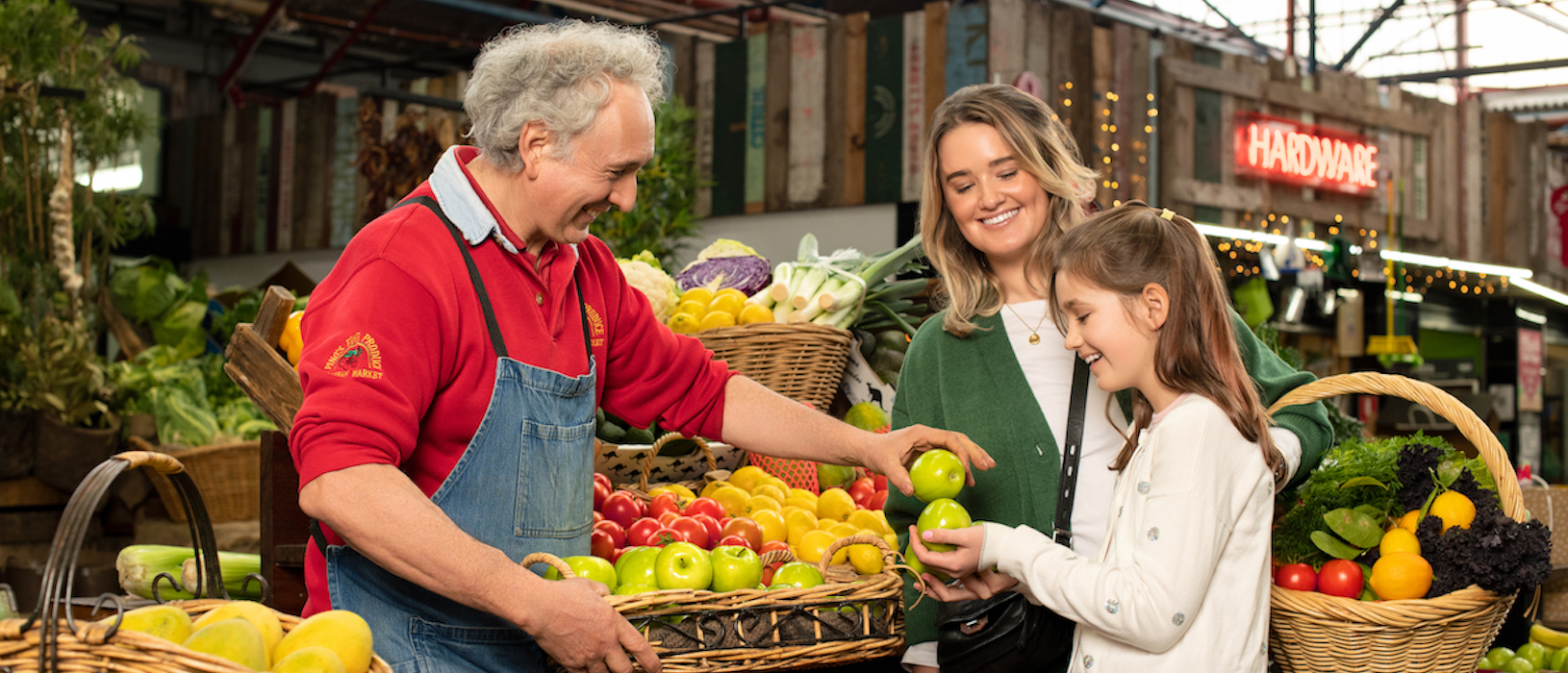
There was also a photoshoot organised with local photographer Carmen Zammit, to capture actual customers of the Market gathering and enjoying themselves. While not easy to shoot with COVID restrictions in place, we managed to achieve some terrific outcomes that are now front and centre of our new campaign.
We’re incredibly pleased with the results and look forward to expanding this new campaign in the coming months. Not only are we one of the premier rebranding agencies in Melbourne, we can also assist with creative design, website development and even complete media planning and buying services. Contact us today and let’s chat!
