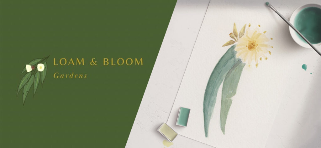
When Loam & Bloom Gardens came to us, they already had a strong foundation and a clear point of view. Alongside their existing logo, they shared a hand-painted watercolour artwork they had created themselves. The illustration (a gum leaf and blossom) carried personal meaning and reflected the way they approached their work: considered, seasonal and connected to nature. Our brief was clear: the new watercolour artwork needed to be thoughtfully incorporated into the logo, while maintaining the brand’s warmth and recognisability. What followed became less about reinvention, and more about carefully evolving the identity to support the next stage of the business.
Building on what was already there
Rather than starting from scratch, we focused on understanding what already resonated.
The watercolour painting brought an organic softness that aligned naturally with Loam & Bloom’s values. Instead of refining it into something overly polished, we chose to preserve its texture and character, allowing the artwork to lead the identity. Our role was to create structure around it, giving the brand clarity and cohesion, while keeping the illustration at the heart of the design.
Refining type and colour to support the artwork
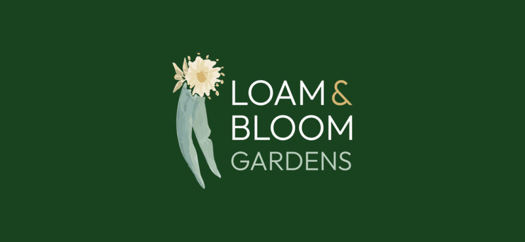
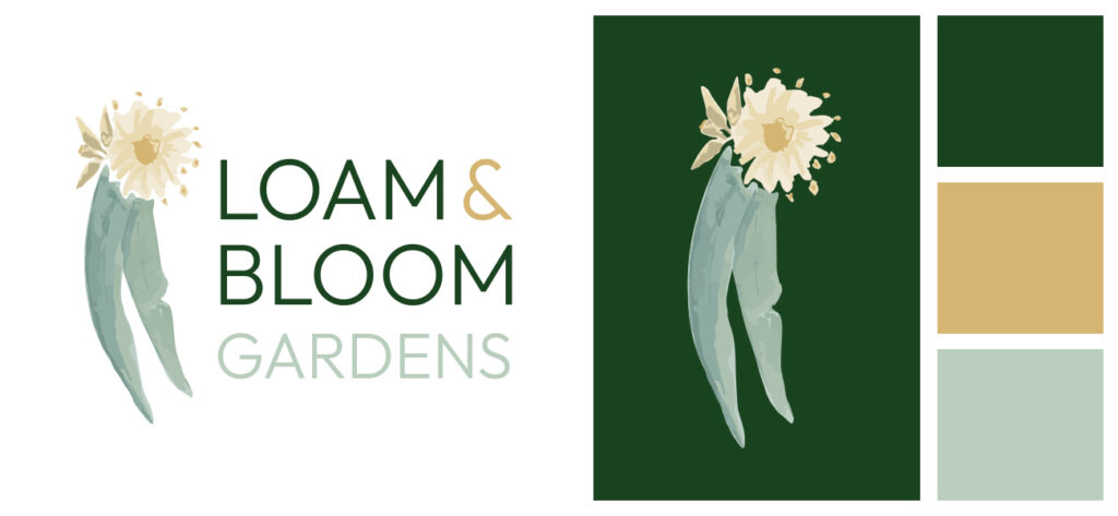
While the brief centred on the illustration, the typography and colour palette presented an opportunity to strengthen the overall system. We refreshed the typography with a more refined and contemporary typeface — one that could sit comfortably alongside the expressive artwork without overpowering it. The result was a balance between softness and structure, helping the logo feel both approachable and considered. The colour palette was also evolved, drawing directly from natural tones found within the artwork itself. Rich greens were paired with softer supporting hues and warm accents, grounding the brand while adding depth and consistency across applications.
Respecting the role of the artwork
From the outset, the watercolour illustration was intended to play a central and expressive role within the brand. The client had a clear vision for how the identity would live across key touchpoints — from digital applications such as the website, through to uniforms, signage and branded merchandise. With these applications in mind, the identity was designed to balance character with consistency. Where the full artwork is appropriate, it remains detailed and expressive; and where a simpler application is required, the logo can be used as a refined wordmark without the watercolour. This flexibility allows the brand to feel cohesive across physical and digital environments, while preserving the handcrafted quality at the heart of the identity.
The outcome: familiar, refined and purposeful
A successful identity refresh should feel like a natural progression.
For Loam & Bloom Gardens, the updated identity retains the personality and care of the original brand, while bringing greater cohesion and confidence to how it’s presented. It’s an identity that feels considered rather than constructed, one that reflects the client’s values and gives them a clear visual language to grow with.